The Greenhouse Gallery
The Greenhouse Tech Hub is Australia’s largest entrepreneurial hub dedicated to climate action. Located in the Foster+Partners designed Salesforce Tower at Circular Quay, the Greenhouse Tech Hub serves as the epicentre of Australia’s climate tech revolution, bringing together climate tech researchers, startups, investors, governments, corporations, universities, not-for-profits and community organisations to connect, collaborate and co-innovate for climate action.
Art of Diversion (AOD) partnered with Greenhouse for the launch of the Greenhouse Gallery in 2023, Sydney’s first art gallery dedicated to climate action. The curated selection of works displayed throughout the space showcased a variety of mediums and creative expressions exploring the relationship between people and planet, addressing topics ranging from energy and resources to waste and the natural environment, all directly or indirectly speaking to the issue of climate change. In selecting the works, AOD placed an emphasis on works which featured reclaimed materials and works which had a strong use of colour to bring both texture and vibrancy to the otherwise neutral palette of the Greenhouse Tech Hub space.
The centrepiece of the gallery is a site-specific work created by AOD that measures nearly 10 metres in length.


Slow the Warming, 2024
Andy Waddle (AOD)
Reclaimed T-shirt fabric offcuts on secondhand board
120 x 930 cm
Permanent installation located on Level 2
The Infographic
Each vertical bar represents a year from 1850 to the present day with the colours showing deviations in average global temperature over time (blue stripes are cooler years, red stripes are warmer years). It’s a chronological history of global climate change that makes the warming trend abundantly clear. Originally conceived by Professor Ed Hawkins, a climate scientist from the University of Reading in the UK, it was designed to be as intuitive as possible for a broad audience. Versions have since been reproduced in numerous contexts ranging from all kinds of murals and installations at events and festivals to being used as the cover design of The Climate Book by Greta Thunberg and Midnight Oil’s album Resist.
The Material
From a distance, Slow the Warming might appear to be painted or printed, but upon closer inspection one will notice that each of the individual stripes is made out of fabric—scraps of organic cotton, hemp and wool from the T-shirt making process, to be exact. The choice of material was a practical one as the intended scale of the piece meant that it needed to be relatively lightweight, but sourcing this particular fabric was the result of a chance encounter.
Serendipitous Sourcing
In what turned out to be a serendipitous turn of events, in the process of sourcing materials for this piece AOD struck up a conversation with the team at Citizen Wolf after walking by their clothing factory in Marrickville one day (which just happened to be right around the corner from AOD’s studio). AOD learned that Citizen Wolf is a slow fashion company that is Ethical Clothing Australia and B Corp certified and, like AOD, committed to 100% circularity and zero-waste. The antithesis of exploitative fast fashion, their clothing is all made-to-order.
Not only were they happy to help by supplying AOD with fabric offcuts, and not only was their range of material well-suited for the specific shades of blue and red that were needed for recreating the graphic, AOD and Citizen Wolf also discovered that they shared a mutual connection in Greenhouse. Citizen Wolf participated in the inaugural Retail Innovation Program developed by Investible (the team behind Greenhouse) in partnership with the City of Sydney a few years back. Small world.
To learn more about Citizen Wolf visit citizenwolf.com or check out @citizen_wolf on socials. Learn more about the warming stripes at showyourstripes.info and @climatehawkins.
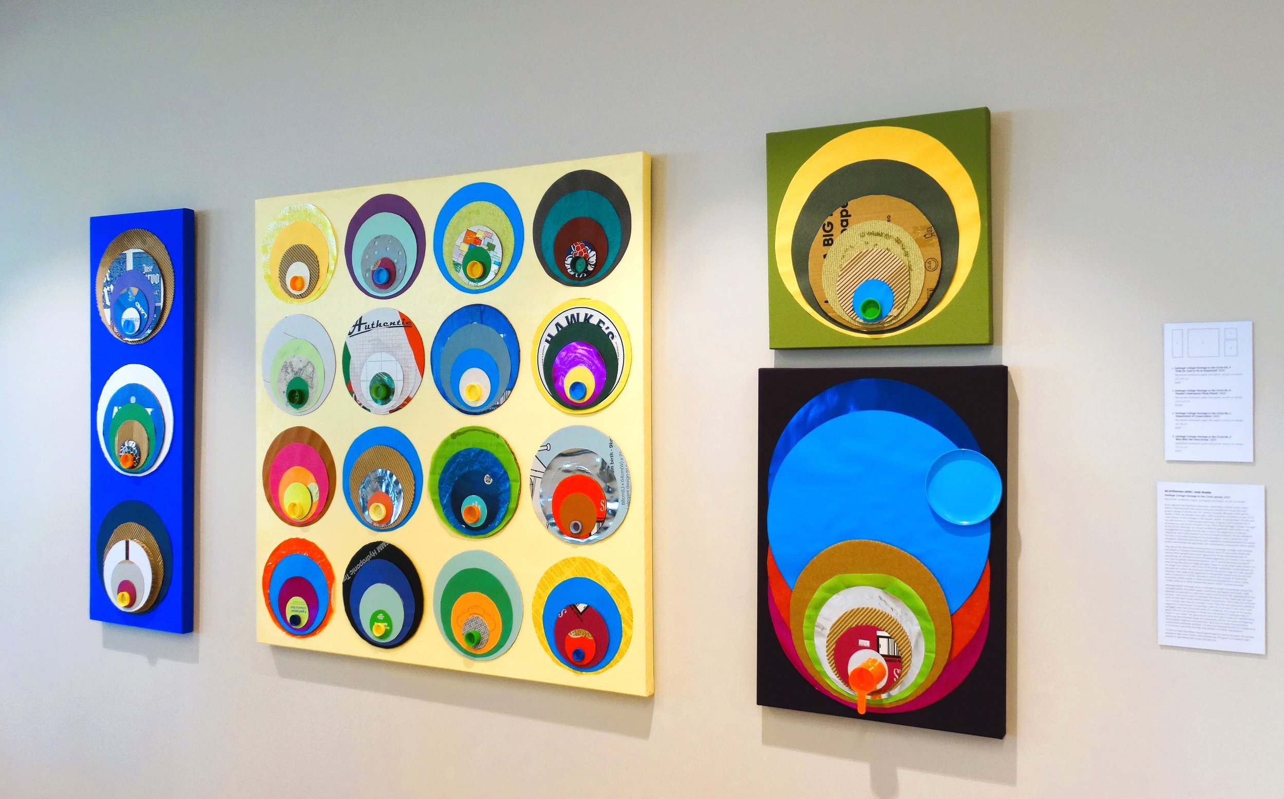

Garbage Collage Homage to the Circle (series), 2023
Andy Waddle (AOD)
Reclaimed cardboard, paper, packaging and plastic, acrylic on canvas
A key figure in the Bauhaus movement, Josef Albers was an artist, colour theorist and educator who had a profound influence on visual arts and graphic design from the mid-20th century onwards. Between 1949 and his death in 1976, he painted more than 2,000 variations of squares as part of his now-famous series Homage to the Square. Albers’ immense body of work and his commitment to continuously exploring a singular motif inspired me to commence a new series of works in mid-2023 titled Garbage Collage Homage to the Circle. Although I’ve chosen a different geometry and medium, the arrangement of shapes and the way in which the adjacency of colours influences their interpretation is a direct tribute to Albers. He was ahead of his time in his understanding of visual perception, colour sensitivity and emergent relational phenomena, and I wanted to somehow extend his unique artistic and intellectual approach into contemporary discussions about waste.
The title of the series (the pronunciations of Garbage, Collage and Homage are meant to rhyme) is intentionally playful, but it is also quite literal and serious. Most people have some vague sense of the interrelatedness of everything, yet we tend to think of waste separately, as if waste is not part of our local or global interconnectedness, as if it somehow exists outside of everything else and just magically goes ‘away’ to some other place where it is no longer our concern. The circles in the series symbolise connectedness (or, the need to connect the dots) and, like the concentric rings of a tree, growth. However, the underlying suggestion is that growth should only be pursued with circularity in mind (as opposed to within the context of traditional economics where waste is rarely properly accounted for). In short, these circles invite us to ‘think outside the square’ when it comes to waste.
Whereas Albers’ Homage series consisted of mostly oil paintings and prints, I’ve used mostly discarded paper, cardboard, packaging and plastic. And whereas he painted in a meticulous way so as to avoid the appearance of any texture, I very much want to highlight the texture of the materials and layer them so that their three-dimensionality is prominent. The circles are all hand-cut. In some cases they are stained or torn. They are not necessarily perfectly aligned or proportional. It is garbage, after all, or at least it was until it was salvaged, and that’s the whole point (it’s a feature, not a bug, as the saying goes). This isn’t an homage in name only; the quality of ‘garbage-ness’ is meant to be visible. The goal was to resist the urge to hide any imperfections and to let the materials speak for themselves. While I do enjoy reimagining what a given material could become, I also like to make its provenance conspicuous whenever possible. It’s about prolonging the life of a material as it is, honestly and with minimal intervention or further degradation.
I’d like to think that Albers would appreciate my nod to his work. He wanted people to see colour from a new perspective. My goal is to hopefully get people to see waste from a new perspective.